Church of the Highlands Rebrand
Art Direction & Branding for Church of the Highlands
Creative Direction & Branding by Landon Benson
Brand Film by Tevis Godfrey and Team
Highlands has shaped us into the designers we are today. Thankful for leaders care deeply about keeping creativity alive and well in the church.

The rebrand of Church of the Highlands began with a simple but important question:
Does the current brand have the agility, flexibility, and stamina to keep up with where we believe God is leading next?
The mandate was simple but weighty: to build on the legacy of what God has already established, never leave our values, and strengthen the identity of who we are as we prepare for what’s ahead. The starting verse of the house remained our anchor.
“The Sovereign LORD is my strength; He makes my feet like the feet of a deer, He enables me to tread on the heights.” Habakkuk 3:19 NIV
This rebrand was not about reinvention. It was about faithfulness. About preparing the church to reach higher heights with the same conviction, humility, and urgency that built what came before. Where it had grown strained. What elements needed to be preserved. What could be archived. And what unresolved decisions we had been quietly working around instead of addressing directly.
Out of this process came a defining statement that would guide every decision:
This is more than a reset. It’s a recommitment. To keep Jesus at the center. To keep the mission in the middle. And to steward what’s ahead.
This became the filter through which the entire rebrand would take shape.
DESIGNING WITH PURPOSE
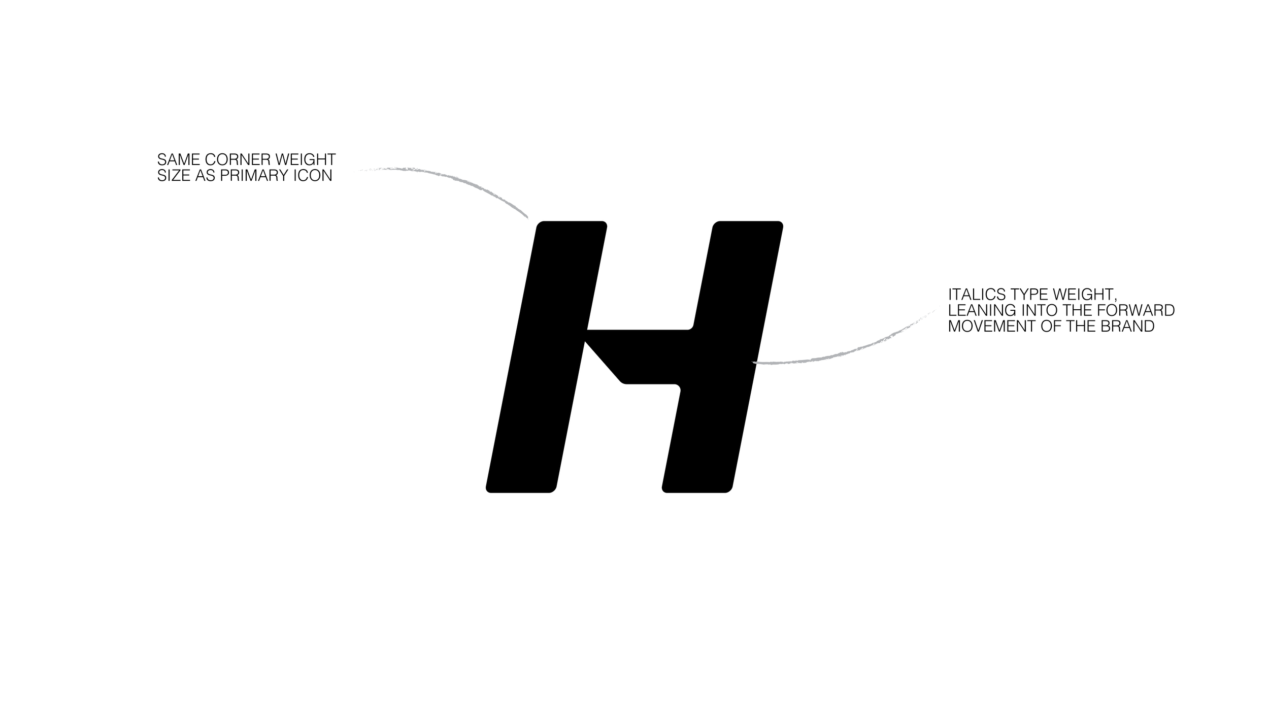
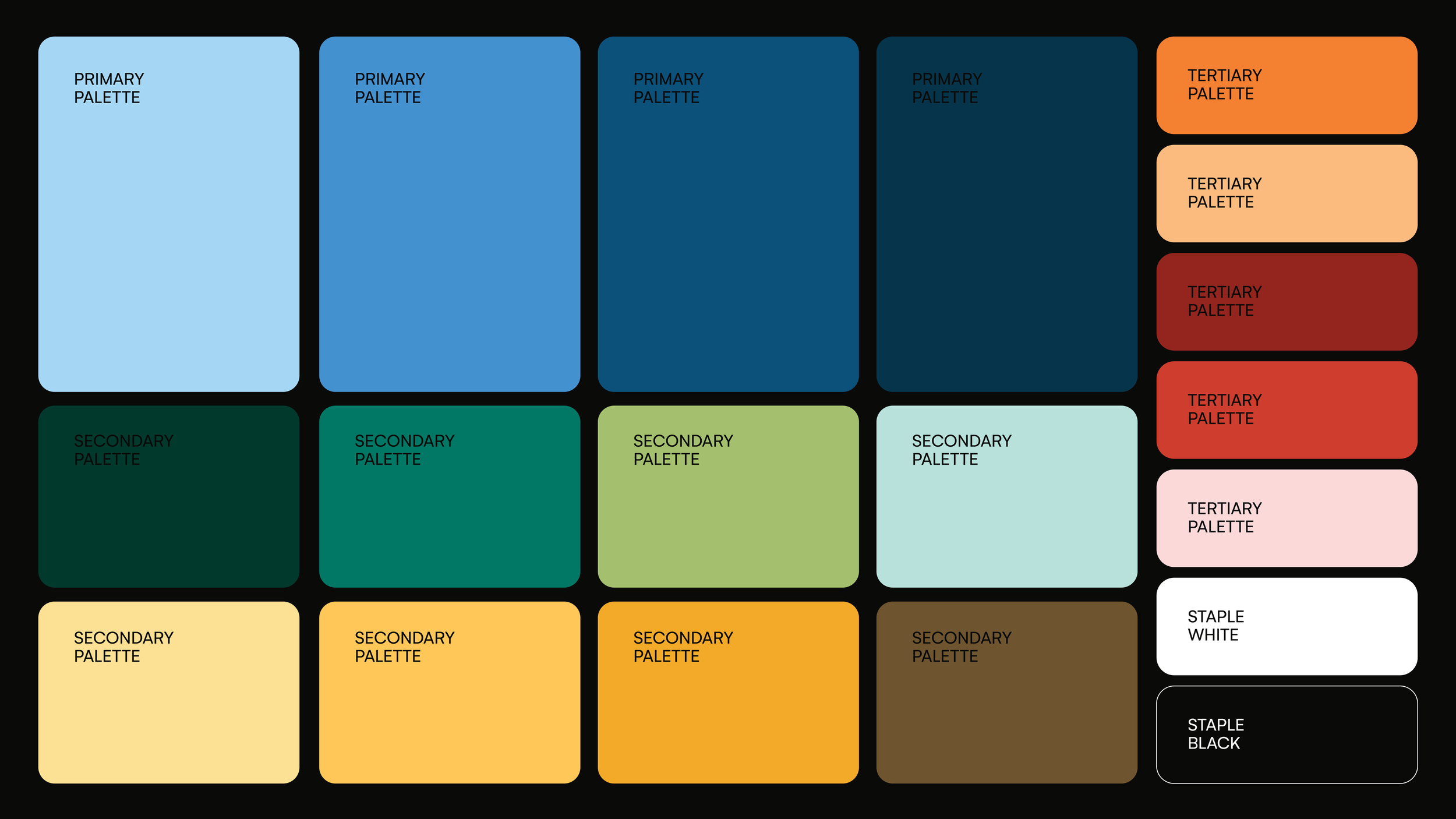
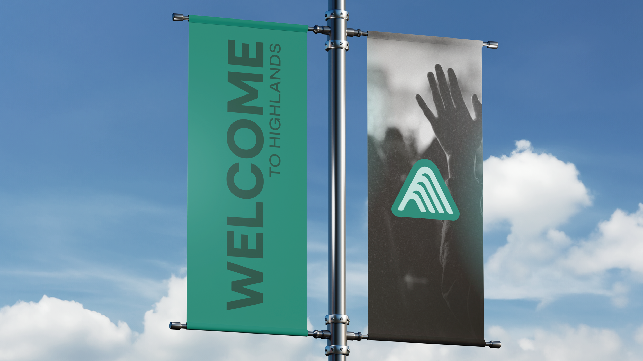
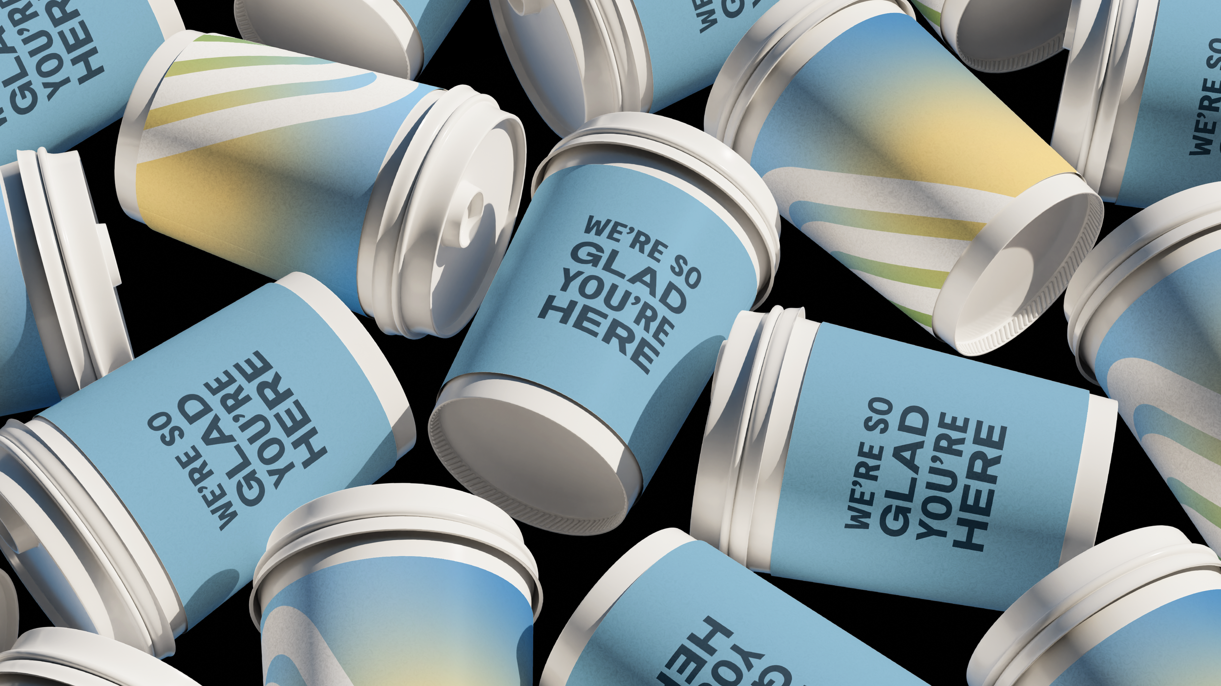
The creative process unfolded through intentional stages of sketching, exploration, and iteration. Early ideas ranged from familiar evolutions to entirely new directions, each tested across real-life applications to ensure the brand could function at scale. Over time, one direction began to stand out. Designed in the silhouette of its predecessor, it introduced a renewed sense of movement, energy, and clarity while remaining connected to its foundation. The result was not just a logo, but a complete system— designed to support every campus, ministry, and leader with consistency and flexibility. Achieving the heart to honor where we’ve been and to reflect on the new that’s ahead.
DISCOVERY BEFORE DESIGN
Seven designers from the creative team came together to begin the research phase. Before creating anything new, we needed to understand the value that already existed. We took stock of how the brand had evolved over the last twenty-five years. How it had been used across ministries and campuses. Where it was strong.
FROM CONCEPT TO THE CHURCH
Once the direction was established, the work expanded beyond design into preparation. Teams across the organization collaborated to plan a thoughtful rollout, ensuring the transition could happen with clarity and stewardship. The new identity was first shared internally with the team, building alignment and ownership before being introduced to the church. On the 25th Anniversary of Highlands, the rebrand was revealed, marking both a celebration of the past and a step into the future.
A RECOMMITMENT
This rebrand represents more than a visual update. It is a recommitment to the mission that has always been at the center: To help people know God, find freedom, discover purpose, and make a difference.
This process reminded us that branding is not simply about creating something new. It is about stewardship. Preparing what we carry today to faithfully support what God is inviting us into next.